The Home & Garden sector faced significant challenges last year, with shifting consumer habits, economic pressures, and unpredictable weather all playing a role. Many brands found themselves competing for a shrinking share of consumer spending, making it more important than ever to stand out. In an industry where products can often seem interchangeable, the brands that succeed are those that offer more than just goods—they create an experience, cultivate loyalty, and build a compelling identity. The question is no longer just about what you sell, but how and why you sell it.

Understanding the Competitive Landscape

With both heritage brands and independent businesses competing for consumer attention, differentiation goes beyond price or product features. Consumers today expect brands to align with their values, whether that’s sustainability, craftsmanship, or exclusivity. Brands that succeed in a saturated market are those that understand their audience’s motivations and reflect them back through everything they do. The challenge for many Home & Garden businesses is ensuring that they are more than just a supplier; they need to be seen as an authority, a lifestyle choice, or a trusted partner in creating beautiful and functional spaces.

Defining and Owning Your Unique Selling Proposition

Every brand has something that makes it different, but few truly capitalise on it. A unique selling proposition (USP) needs to be more than just a statement; it must be deeply embedded in your brand’s operations, communications, and customer experience.

Consider a UK garden tools brand that built a loyal following by focusing on craftsmanship and durability. Rather than competing on price with mass-market alternatives, they emphasised heritage, the skill involved in manufacturing, and the superior quality of their tools. Every element of their branding, from packaging to website copy, reinforced these values, creating a clear reason for customers to choose them over cheaper competitors. Their success lay not just in their product, but in how they positioned it.

The Power of Brand Storytelling

People don’t just buy products; they buy into the stories behind them. A compelling brand narrative goes beyond listing features and benefits, it evokes emotion, fosters connection, and makes your brand memorable. Home & Garden brands have a unique advantage in this area because their products naturally lend themselves to storytelling. The transformation of a garden, the craftsmanship behind a piece of furniture, the environmental impact of sustainable sourcing – these are all powerful narratives that can strengthen a brand’s presence and influence purchasing decisions.

The most successful brands ensure that storytelling isn’t confined to a single campaign but is interwoven across all marketing efforts. From the language used in product descriptions to the behind-the-scenes content shared on social media, every touchpoint should reinforce what makes the brand special.

A Cohesive and Recognisable Visual Identity

In an industry that is highly visual, design plays a crucial role in brand differentiation. A strong visual identity isn’t just about an attractive logo; it’s about ensuring that every element: colours, fonts, photography, and packaging, works together to create a seamless and recognisable presence. Customers should be able to identify your brand at a glance, whether they’re browsing your website, scrolling through social media, or seeing your product on a store shelf.

Beyond aesthetics, consistency is key. A brand that has a polished website but lacks cohesion on social media or in-store displays risks confusing customers and diluting its impact. Developing (and consistently applying) clear brand guidelines can ensure uniformity, reinforcing credibility and trust.

Customer Experience as a Competitive Advantage

The most enduring differentiator in a crowded market is not a product but an experience. When every business is offering similar products, what makes customers return is how they feel about the brand. This encompasses every interaction; from the moment they visit your website to the after-sales service they receive. Businesses that invest in customer relationships rather than just transactions see far greater long-term loyalty.

Personalisation can be a game-changer in the Home & Garden sector. Brands that understand their customers’ preferences and offer tailored advice or recommendations build stronger emotional connections. Exceptional customer service, thoughtful packaging, and proactive engagement all contribute to shaping an experience that customers will remember and share.

Leveraging Digital and Social Media to Build Authority

Digital channels provide a unique opportunity for Home & Garden brands to educate, inspire, and connect with their audience. Unlike traditional advertising, digital marketing allows for two-way engagement, where brands can build communities rather than just push messages.

A well-executed content strategy that combines inspiration, education, and storytelling can position a brand as an industry leader. High-quality blog articles, expert tips, behind-the-scenes videos, and user-generated content all contribute to building authority and credibility. Visual platforms like Instagram, TikTok and Pinterest are particularly powerful in this sector, as they allow brands to showcase their products in real-world applications, giving potential customers ideas and inspiration.

Strategic Partnerships for Market Differentiation

Collaboration can be a powerful way to expand reach and credibility. Partnering with industry experts, designers, or sustainability advocates not only exposes a brand to new audiences but also reinforces its expertise and values. Co-branded products, event sponsorships, and strategic alliances with complementary brands can create additional layers of differentiation, offering something that competitors do not.

Conclusion: Positioning Your Brand for Longevity

In a crowded and challenging market, differentiation is no longer about competing on price or features, it’s about creating a brand that people connect with and trust. A strong USP, compelling storytelling, a cohesive visual identity, and an exceptional customer experience all contribute to making a brand not only stand out but endure.

The brands that thrive are those that evolve beyond being mere providers of products. They position themselves as indispensable, shaping trends, influencing purchasing behaviour, and becoming part of their customers’ lifestyles.

For businesses looking to refine their positioning, now is the time to assess what truly sets them apart and ensure that message is consistently delivered across every interaction. WrightObara can help brands elevate their strategy and carve out a meaningful presence in the Home & Garden sector.
A company’s brand is more than just a logo or colour scheme—it shapes how customers perceive and remember the business. Whether a company actively manages its brand or not, it already exists, and how well it is defined influences customer trust, loyalty, and overall success. In the Home & Garden sector, where authenticity and emotional connections play a key role, a strong and consistent brand is essential. However, many small and medium-sized businesses (SMEs) lack a clear brand strategy, leading to confusion and missed opportunities.

Branding: More Than Just Looks

Branding goes beyond visual elements; it reflects a company’s reputation, values, and messaging. Customers in the Home & Garden industry seek brands they can trust. A well-managed brand differentiates businesses from competitors and fosters long-term customer relationships. Companies that actively shape their brand’s story tend to attract more loyal customers, while inconsistent branding can make it harder to build recognition and credibility in the marketplace.

As SMEs grow, marketing often takes a back seat, managed by business owners or sales teams without branding expertise. Without a clear strategy, marketing efforts may become scattered, resulting in inconsistent messaging. Social media posts, advertisements, and promotions may all have different tones and styles, making it harder for customers to connect with and remember the brand. Without a well-defined brand identity, businesses struggle to establish a strong market presence.

The Power of Storytelling in Branding

One of the most effective ways to build a strong brand is through storytelling. A compelling brand tells a clear, engaging story that emotionally resonates with customers. In the Home & Garden sector, consumers gravitate toward brands that align with their values, such as sustainability, quality craftsmanship, or a passion for design. A brand story helps customers choose one company over another by creating a meaningful connection.

Successful brands ensure their storytelling is consistent across all marketing channels. From websites to social media and product packaging, every interaction should reinforce the same message and values. When a company tells a clear and meaningful story, customers are more likely to remember it and develop a personal connection. However, if branding is inconsistent across platforms, it can create confusion and weaken customer trust.

The Consequences of an Inconsistent Brand

Without clear marketing leadership, an SME’s brand can become inconsistent. This often happens when multiple people manage marketing without a shared strategy. If a company’s website, social media, and promotional materials present different messages or styles, customers may struggle to understand what the brand represents.

Inconsistent branding also results in wasted marketing efforts. Businesses that invest in short-term campaigns without a long-term plan often struggle to build recognition and loyalty. Instead of spending money on isolated marketing efforts, companies should focus on a long-term branding strategy that fosters growth and relevance in their industry.

Why SMEs Need a Marketing Leader

One of the biggest challenges for SMEs is determining who is responsible for brand management. Many assume marketing can be shared among employees or outsourced without strong leadership. However, without a dedicated leader shaping and maintaining the brand’s identity, a company may struggle to stand out in the market.

For many SMEs, hiring a full-time marketing director is financially impractical. A great alternative is working with a fractional marketing director—an experienced marketing professional who provides leadership on a part-time basis. This allows businesses to benefit from expert guidance without the expense of a full-time hire. A fractional marketing director can oversee brand messaging, campaign execution, and overall marketing strategy to ensure all efforts align with long-term goals.

Additionally, a fractional marketing director brings fresh perspectives and industry insights. Internal teams can become too focused on day-to-day tasks, missing new opportunities for improvement. A marketing expert introduces innovative strategies and modern techniques to help businesses adapt to changing customer expectations.

The Long-Term Benefits of a Strong Brand Strategy

At WrightObara, we believe a brand is an evolving story that requires careful attention and planning. Our approach focuses on long-term brand growth, helping Home & Garden businesses establish a strong, lasting presence in their industry. A well-managed brand is not just about what a company sells—it’s about what it stands for and how customers connect with it.

A structured branding strategy helps businesses scale effectively. When a company expands its product range or enters new markets, a clear and recognisable brand simplifies the transition. Without a strong brand foundation, growth efforts can lead to mixed messaging and confusion. By ensuring a consistent brand identity, businesses can maintain customer loyalty and build new relationships with confidence.

Putting Strategy to Work: The Delivery Model Behind Consistency

Strong brands are built in the day-to-day. Consistent messaging across channels, disciplined planning, and the right capacity at the right moment turn positioning into performance. Whether that capability sits fully in-house or with an embedded partner, the mechanics matter: clear campaign plans, comms calendars, status rhythms and accountable workflows keep strategy honest and execution on time. The outcome is targeted communication that resonates with the audiences that matter most and compounds value with every cycle.

Is Your Brand Helping or Hurting Your Business?

Business owners should ask themselves: Is our brand helping us grow, or is it holding us back? If marketing feels unorganised or inconsistent, it may be time to rethink the company’s branding approach. Branding is not an afterthought—it’s a crucial factor in long-term success. A clear and well-managed brand makes a company more competitive, increases customer trust, and creates new opportunities for growth.

Investing in branding provides long-term benefits. Companies that prioritise brand management gain stronger recognition, greater customer loyalty, and a competitive advantage. Instead of treating branding as a secondary concern, businesses should make it a core part of their success strategy. Whether working with a full-time marketing director or a fractional leader, having someone dedicated to brand management can make all the difference in achieving long-term growth.

Outsourcing has become a default response to busy pipelines and lean teams. It can fill gaps and keep the wheels turning, yet it often treats creative delivery as a series of transactions. Brief in, asset out. In the Home and Garden sector, where the last year has demanded sharper focus and greater efficiency, there is a better way. Integration. An agency that operates as part of the team, not adjacent to it, creates stronger brand coherence, faster decision making, and work that compounds value over time.

This article sets out what that model looks like in practice, why it outperforms traditional outsourcing, and when it is the right move for a senior team balancing growth, governance and brand outcomes.

From supplier to teammate

Traditional outsourcing keeps a helpful distance. It works for one‑off projects or overflow tasks. But distance also creates drag. Every new brief requires context, brand calibration and back‑and‑forth on tone, format and decision rights. Integrated partnerships remove that drag because the partner already understands the internal roadmap, the pressures on stakeholder groups, and the difference between what is urgent and what is important. The result is less time explaining and more time improving.

Integration is not about sitting on site or wearing a different badge. It is about shared context, shared standards and shared accountability. An integrated partner is present earlier in the conversation, contributing to the problem framing, not just the execution. They understand how seasonal dynamics, trade calendars and retail relationships shape priorities. They know where the brand can flex and where it must hold the line. That proximity allows the work to move at pace without sacrificing quality or brand integrity.

Why integration outperforms outsourcing

There are three effects at play when you embed a creative partner. First, compounding knowledge. Familiarity with the brand, the product roadmap and the decision makers grows month by month. The work benefits from a memory, and that memory prevents avoidable errors, repetitive debates and inconsistent choices. Second, coherence. When a single partner stewards campaigns across channels, assets feel related, not stitched together. The story builds, and customers notice. Third, strategic continuity. Teams change, priorities evolve, yet the brand keeps its shape because someone is protecting and evolving it every day.

These effects are especially valuable in our sector. Home and Garden brands sell aspiration and utility in the same breath. They rely on storytelling as much as specification. Integrated teams are better placed to blend the two, to connect seasonal demand with long‑term positioning, and to turn individual campaigns into a cumulative narrative that lifts the whole brand.

A simple model for compounding value

Outsourced chain: Brief → Create → Deliver.
Integrated loop: Brief → Context → Create → Measure → Learn → Brief.
The loop matters. It captures learning, feeds it back into the next cycle, and turns creative delivery into an engine for continuous improvement. Integration also delivers the advantages leaders often seek from outsourcing: rapid turnaround, scalable capacity and specialist skills, while preserving coherence and brand governance across every touchpoint.

.

What integrated delivery looks like

A useful way to describe the model is to follow a project from the moment an idea surfaces to the moment it lands with a customer. In an outsourced arrangement the partner typically appears after scope and outputs are set. In an integrated arrangement the partner helps define the scope, tests assumptions about the audience and identifies the assets that will actually move the numbers. Creative direction, copy, design and production follow, yet the value comes earlier: aligning the brief with commercial objectives, protecting the brand while finding space for freshness, and ensuring the team is solving the right problem.

In practice this means joining planning meetings, pressure testing the campaign architecture, and carrying the brand through to every touchpoint, from packaging and POS to email flows and social. It also means owning the rhythm of delivery. Status, calendars and asset libraries are tools for momentum, not administration for its own sake. The benefit for senior leaders is focus. Less supplier wrangling, fewer quality escalations, more time spent on the decisions that only they can make.

Quality, speed and governance can co exist

There is a perception that you can have two of the three at best. With the right model the trade‑off is smaller. Speed improves because the partner is already up to speed. Quality improves because the partner understands the brand and has the latitude to push for better. Governance improves because there is a single accountable owner, not a patchwork of freelancers and studios. The discipline comes from simple operating habits. Clear briefs. Version control that actually controls versions. Pre‑agreed routes for fast approvals and for high‑stakes reviews. The result is calm delivery, even when deadlines are tight.

Protecting the brand while pushing it forward

Integrated teams make better guardians. They see patterns across channels and spot drift early. They also know when to push for evolution. Brands stagnate when every asset is an exact repeat of the last. They grow when the core is protected and the edges are explored with intent. An embedded partner has enough context to propose those step‑changes at the right moment, whether that is a shift in narrative, a packaging refresh, or a new content format that fits the brand rather than chasing a trend.

Commercial impact you can see

Senior leaders need to see a link between creative activity and commercial outcomes. Integration helps here too. When the partner is involved from strategy through to execution, they can instrument campaigns properly, define what success looks like, and report on more than impressions. Over time this creates a feedback loop that sharpens creative judgement. What we learn in one channel improves the next, and the next. The brand earns compound interest.

When the model makes sense

Integration is not a one‑size solution. It adds the most value in a few common scenarios. A brand is growing and wants to scale without building a large in‑house team. A marketing function is strong but stretched and needs a partner that lifts both capacity and capability. A leadership team wants fewer suppliers and clearer accountability. Or a company is entering a new phase, perhaps a rebrand or retail expansion, and needs a partner who can hold strategy and execution at the same time.

What to look for in an integrated partner

Experience in the sector matters, but so does attitude. Look for a team that asks better questions, that challenges assumptions respectfully, and that is as comfortable in the board pack as in the design file. Expect them to document the brand in a way that is usable by everyone, not buried in a guideline PDF. Expect constructive candour. Expect them to measure and to care about the same outcomes you do. Above all, expect them to behave like colleagues.

WrightObara’s approach

For over fifteen years we have worked this way with long‑term partners, often acting as the in‑house studio and strategic team. We bring strategy, visuals and storytelling together, shaping brand platforms and delivering the daily work that keeps them alive. We move quickly when needed, we push for better when it counts, and we keep the brand consistent across every touchpoint. Our aim is simple, to help market leaders and challengers in the Home and Garden sector grow with clarity and conviction.

Final thought & next step

Outsourcing solves for output. Integration solves for outcomes. If you want fewer handoffs, more coherence and creative that builds value quarter after quarter, consider an embedded partnership. It is a smarter model for creative delivery because it treats brand as a system, not a set of jobs to be done.

If you’re weighing the trade‑offs between speed, quality and governance, we can run a light‑touch audit of your creative operating model and highlight where integration would have impact. When your agency works as part of your team, the work gets better—and so do the results.

At Glee 2025, one theme kept resurfacing in our conversations: most garden centres are already sitting on the ingredients for better marketing performance. What is often missing is not another channel, but a clearer strategy for using the channels they already have.

In our latest episode of The Underground Podcast, we explored two that are sometimes seen as “nice-to-have” rather than central: loyalty programmes and paid media. Phil and Kate were joined by Vanessa Cranford from Spring Marketing, and Aaron Rudman-Hawkins from The Evergreen Agency, to unpack what happens when you treat these as core commercial tools rather than side projects.

This blog pulls out a few of the business-focused lessons for home and garden brands.

Loyalty isn’t a cost centre

One of Vanessa’s strongest observations was that many garden centres still file loyalty under “expense”, not “profit”. As she put it: “I think a number of garden centres look at loyalty as a cost centre, rather than it being a revenue generator.”

When you only see the voucher line on a P&L, it’s understandable. The value becomes clearer once loyalty is properly connected to EPOS and reporting. That is when you can see:

  • Who your best customers are
  • How often they visit
  • What they actually buy
  • How their behaviour differs from non-members

Vanessa describes the difference neatly:

“10,000 members is vanity, 7,000 members are active is your sanity, and 3,000 of them are actually contributing 40% of profit to your business. And that’s king.”

In other words, the headline number on the database is not the point. The commercial opportunity lies in identifying the core group who drive a disproportionate share of margin, then designing your communications, offers and experience around them.

Crucially, this is not just about discounts. For the most loyal customers, Vanessa stresses that: “It’s about making people feel special.”

Priority invites, early access, tailored content, thoughtful thank-you moments in-store: these are all creative decisions as much as technical ones. Which is where loyalty stops being a “scheme” and becomes part of the brand.

“A loyalty programme is not an island off the coast of the brand.”

That line should probably be on a lot of marketing office walls.

Paid media: Powerful, but not a silver bullet

If loyalty can be misunderstood as a cost, paid media can be misunderstood as a shortcut. Aaron captured that tension with a memorable line on the podcast: “Google Ads… is a good example. It’s a drug. It’s like a drug.”

Used well, search and social advertising can be one of the fastest ways to drive incremental revenue. Used badly, they create dependency without building any real brand equity.

Aaron’s starting point is very simple: most garden centres do not need national fame.

“Most businesses don’t need to be famous to everyone. You need to be famous to a few.”

For a bricks-and-mortar site, the priority is to dominate your local area:

“If you are a bricks and mortar business as garden centres are, you need to be known within a ten-mile radius. Win the postcode, you win the weekend… localised clicks fill car parks.”

That means understanding the different jobs each channel does. Search captures people already looking for what you offer. Social helps you stay present, retarget visitors, and promote reasons to visit again: events, café offers, new ranges.

The economics matter as much as the creative. Average order value, margin and repeat purchase rates all influence what you can sensibly afford to spend on a click. You do not fix a weak proposition or poor experience with more budget. Instead, Aaron argues for keeping the framework straightforward:

“What I love about marketing these days, is it can be complicated, and I think there’s a real art to keeping things simple.”

Simple questions, such as:

  • Who exactly are we trying to reach in our catchment area?
  • What do we want them to do in the next four weeks?
  • How will we know if these ads are driving profitable behaviour, not just traffic?

Where WrightObara fits in the mix

As an agency, we do not run loyalty platforms or buy media on behalf of clients. Partners like Spring Marketing and The Evergreen Agency specialise in those disciplines.

However, conversations like this matter deeply to us because every channel is only as strong as the brand and customer experience behind it.

A loyalty database becomes far more valuable when:

  • Your in-store experience gives people a reason to scan every visit
  • The brand feels consistent from card to café to compost bag
  • The content and campaigns that surround the programme feel distinctive and worthy of attention

Paid search and social become far more efficient when:

  • The landing experience is clear, helpful and visually on-brand
  • The proposition is well defined, so you are not paying to promote “just another garden centre”
  • Your creative feels like an extension of the stories customers see in-store, not a disconnected advert

At WrightObara, our role is to help home and garden brands shape that story, then express it consistently through design, content and campaigns. Loyalty and ads perform better when they plug into a coherent narrative about who you are, what you stand for, and why a shopper should choose you.

Designing a smarter mix for the next season

Looking ahead, the most successful garden retailers and suppliers will not be the ones who simply “add another channel”. They will be the ones who:

  • Treat loyalty as a strategic asset, not a tick-box exercise
  • Use paid media carefully, to amplify what already works commercially
  • Invest in the brand, creative and customer experience that make every channel work harder

The conversations with Vanessa and Aaron underlined something we see again and again in our own work: the real gains come when data, digital and design are working together, not competing for budget.

If you are reviewing your marketing mix for the next season, the questions might be less about “Should we do loyalty?” or “Should we do more ads?” and more about:

  • “What are we asking these channels to do for the business?”
  • “Are we telling a clear, consistent story wherever our customers meet us?”

That is the space where we love to work with clients: helping brands in the home and garden sector clarify their story, sharpen their proposition and create campaigns that connect, whether they are delivered via a loyalty email, an in-store poster or a sponsored post in someone’s Sunday scroll.

Check out the full episode of The Underground Podcast, featuring Vanessa Cranford of Spring Marketing and Aaron Rudman-Hawkins of the Evergreen Agency, below:

Walk the NEC and you’ll see plenty of nice builds. I’m Jan Obara, Creative Director at WrightObara, and the stands below went further: they stopped people, made a point quickly, and gave the team a simple way to start meaningful conversations. That’s the job.

Lodi UK: Turning pest control into a talking point

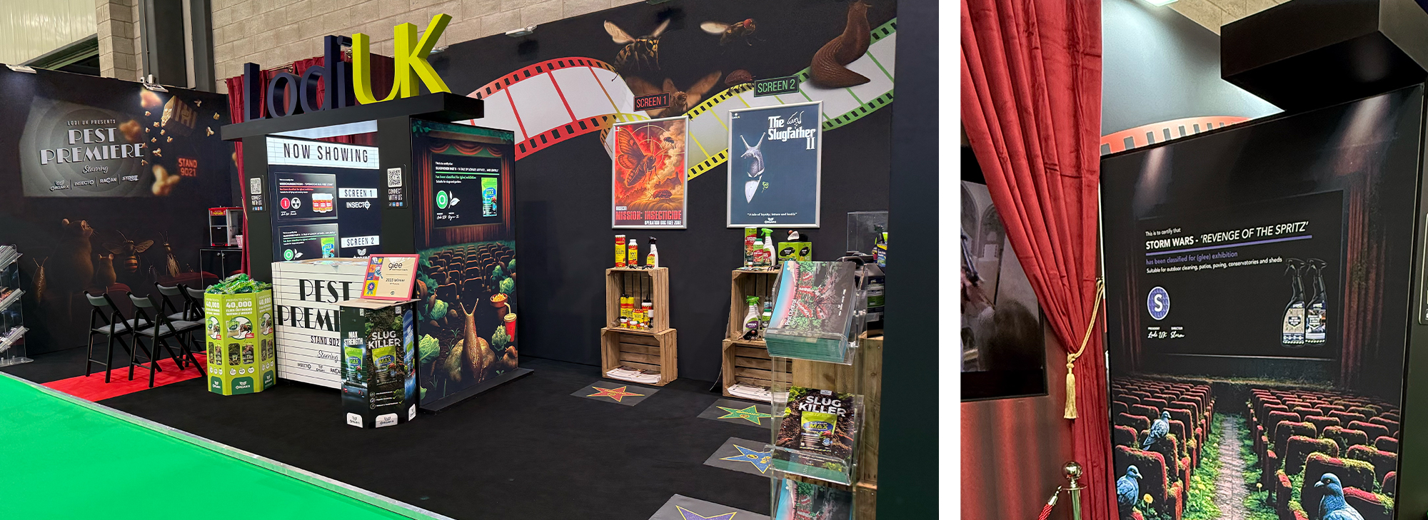
You couldn’t miss it: cinema-style marquee lights, bold movie posters, trailers looping on screens, and popcorn that made people linger. Lodi went full “night at the movies”, then used that theatre to put real product stories up in lights. Cheeky titles like The SlugfatherMission: Insecticide, and Storm Wars did the stopping; the stand copy and team chat did the explaining. Result: smiles, photos, and chatter for a category that rarely gets any.

Why it caught my eye

It was fun without being throwaway. The cinema foyer feel, dramatic lighting and clear graphics worked together, so nothing fought for attention. The concept sparked curiosity: “What’s this all about?” which opened the door for a quick, useful product chat.

The details doing the work
  • Simple world, well executed: The cinema motif ran through posters, screens and signage, so the look felt intentional and tidy.
  • Built-in dwell: Popcorn and sweets slowed the pace just enough for a conversation, without creating a blockage.
  • Clear handover to product: The “Hollywood moment” gave each SKU a spotlight, then handed neatly to proof points like pet safety, rainfast performance and glyphosate-free
  • Shareable by design: The titles and visuals encouraged photos and posts, helping the idea travel beyond the aisle.
Why it matters (for marketers)

A playful frame can make a functional category feel fresh, as long as the message is easy to find. Lodi earned attention with theatre, then used it to land the real story: safer, effective products you can trust.

What you can borrow
  • Pick one clear concept and commit to it across signage, props and staff lines. Don’t half-do it.
  • Create intrigue at the entrance so people step in wanting to learn more.
  • Give each hero product a one-liner staff can deliver in five seconds, backed by one benefit and one proof.
  • Engineer a small ‘moment’ (like popcorn) to create a natural pause without blocking flow.

Inferno: A nudge and a wink, executed with care

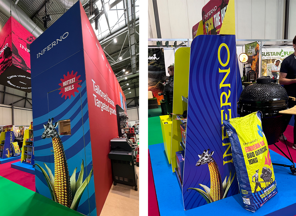
You don’t often see a trade stand make people grin before they’ve read a single word. Inferno did. While many exhibitors went for sleek and safe, they leaned into British surrealist humour (think a scene straight out of Monty Python’s Flying Circus) and used it to pull people in. Quirky props, unexpected signage and tongue-in-cheek product storytelling turned the space into a little sketch that you could wander through. In a hall of predictable displays, that boldness made it unforgettable.

Why it caught my eye

Inferno could have lined up kamado grills and outdoor cooking kit and called it a day. Instead, they built a playful world around them. The result wasn’t gimmicky; it read as confident and original, with the products still front and centre once you stepped closer.

The details doing the work
  • Visual jokes that land fast: Oversized props and playful graphics created instant-stopping-power without cluttering the view of the grills.
  • Staff in on the joke: The team stayed in character and kept the delivery deadpan. It gave the stand energy and consistency across the day.
  • A wink in the copy: Each grill and accessory was introduced with humour, then the practical points followed. Visitors got the personality and the product in one hit.
What people were saying

Social posts picked up on the tone immediately — lines like “And now for something completely different…” and “Is this a trade stand or a comedy sketch?” popped up through the show. More than a novelty, it was one of the most remembered stands, precisely because it made people feel something before it asked them to think.

Why it matters (for marketers)

Humour, handled well, buys you time. Inferno’s approach created dwell without needing long explanations; once people were smiling, they were open to the product story. That is a useful lesson for categories where features can blur into each other: lead with a human moment, then make the benefit clear.

What you can borrow
  • Commit to one tone and run it through everything: Visuals, micro-copy and staff lines, so it feels intentional, not random.
  • Plan the handover from joke to product: One clean sentence that staff use every time to connect the smile to the spec.

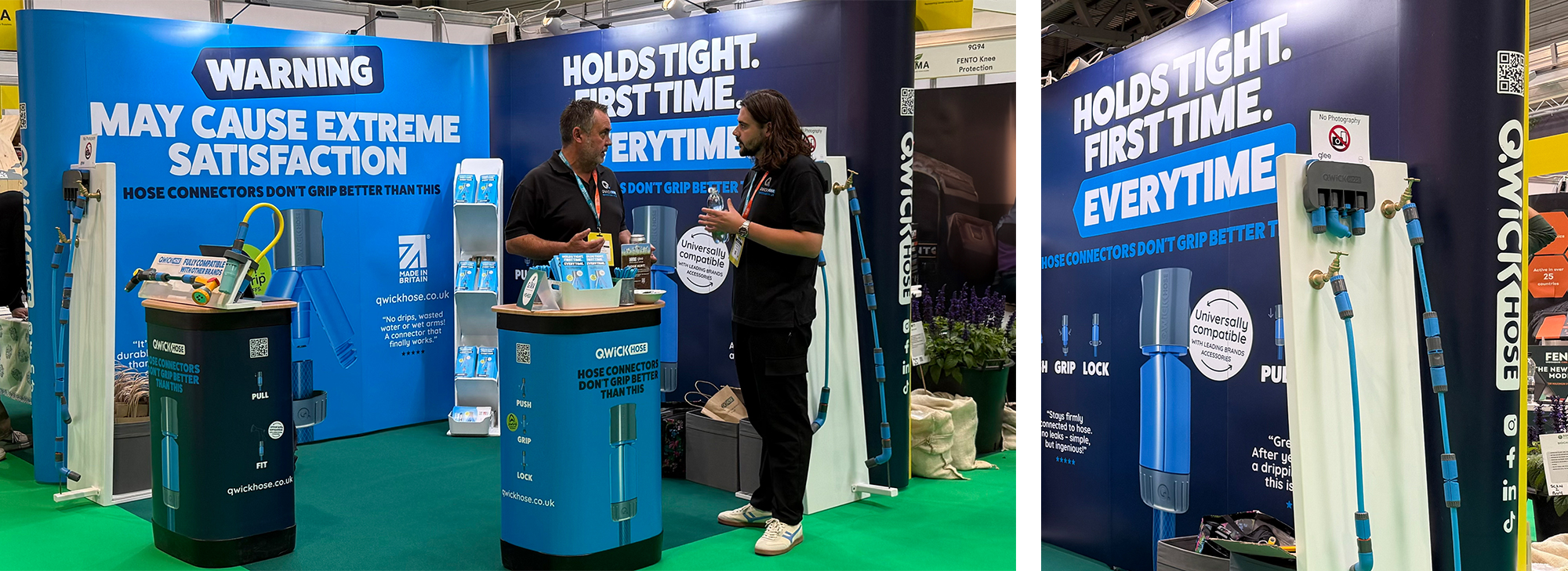
QwickHose: Bold headlines, colour that pops, branding that holds it all together

From the aisle, this stand hit you with confidence: big, punchy headlines you could read on the move, clear blocks of brand colour, and a tidy visual system that held everything in place. That combination did the stopping. Only once you’d stepped in did you notice the product details and the neat opportunities to see the JawGrip connector in action. The message hierarchy was spot-on: brand and promise first, product proof second.

Why it caught my eye
  • Headlines with intent, short, active lines that told you exactly why QwickHose is worth a look: fewer leaks, easier watering, kit that lasts. You didn’t need to hunt for meaning; it came to you.
  • Colour blocking with discipline: Strong, consistent panels guided the eye and made the space feel larger and clearer. The brand palette wasn’t just decoration, it was wayfinding.
  • Cohesive identity: Type, layout and iconography were consistent across walls, plinths and product cards. Nothing jarred, nothing fought for attention, which made the whole range feel considered and premium.
  • Hands-on proof: Demo-rigs showed JawGrip at work, but they sat within the system rather than shouting over it. If you wanted to feel the difference, you could. If you just needed the story, it was already on the wall.
What a marketer can borrow
  • Lead with one big promise in big type. If someone only reads six words, make them the right six.
  • Use colour to organise, not just decorate. Reserve your strongest tone for headlines and anchors; let supporting areas breathe.
  • Keep proof visible but optional. Not everyone wants a demo. Give them the conclusion up front, then let the curious dig in.

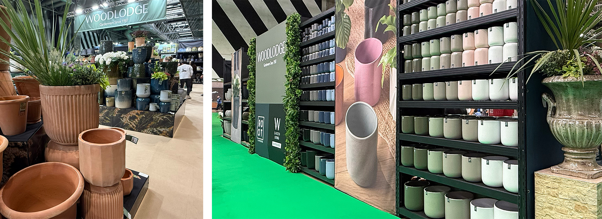
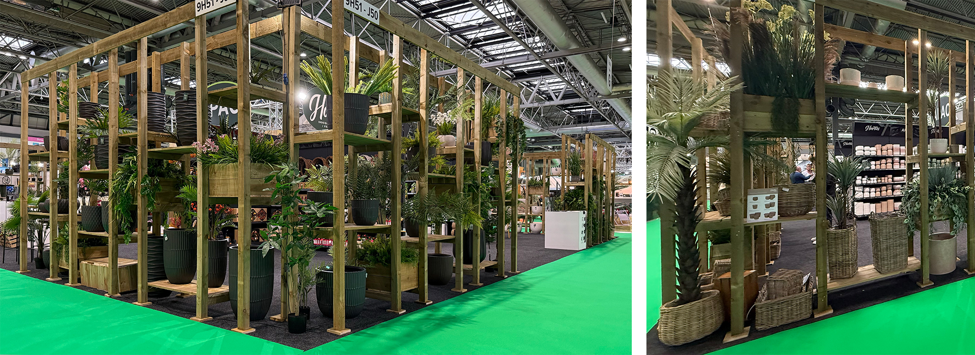
Woodlodge: Big, beautiful, and built to guide decisions

Woodlodge didn’t just put products on a platform; they built a space you wanted to walk through. At a glance you felt the scale: tall structure, open plan, plenty of air. But once inside it read like a curated gallery rather than a warehouse. The ambition was obvious, and so was the care in how it was laid out.

Why it caught my eye

Woodlodge are known for premium planters and garden décor, and the stand used that strength to full effect. It was an architectural statement first, and then a set of clearly signposted stories: seasonal trend areas, lifestyle displays with visually merchandising that made it easy to picture how ranges could land in retail or in a customer’s garden. That combination – scale plus structure – is what elevated it.

The bits doing the heavy lifting
  • Architectural impact: Height and openness created a feeling of confidence. You could see in from multiple angles, which kept flow smooth and reduced bottlenecks.
  • Trend-led styling: Zones picked up on natural textures, earthy tones and sustainable materials. Each zone told a quick story, so buyers didn’t have to imagine from a spec sheet.
  • Gallery mindset: Products were given space. Nothing felt crammed, so form, finish and scale were easy to assess.
  • Clear wayfinding: The open plan encouraged a natural loop: see the hero, step into a trend area, then out to the next. It came across as intentional, not accidental.
What people were saying

Comments on the day described it as “a show within the show” and “a masterclass in visual merchandising.” That’s a fair reading: the stand set a bar for how to turn a large range into simple, shoppable ideas, while keeping the whole thing elegant.

Why it matters (for marketers)

Large assortments can get messy fast. The stand didn’t just impress; it shortened the mental distance between “nice products” and “I can see this working in my display.”

What you can borrow
  • Frame decisions, not just products. Build zones around shopper missions or seasons so buyers can lift ideas straight into store.
  • Design for the lens. Give every zone a clean, front-on shot. You’ll multiply post-show usefulness in decks and social recaps.
  • Keep the air. Space is a signal of value. If you’re going big, let the products breathe to avoid bargain-basement clutter.

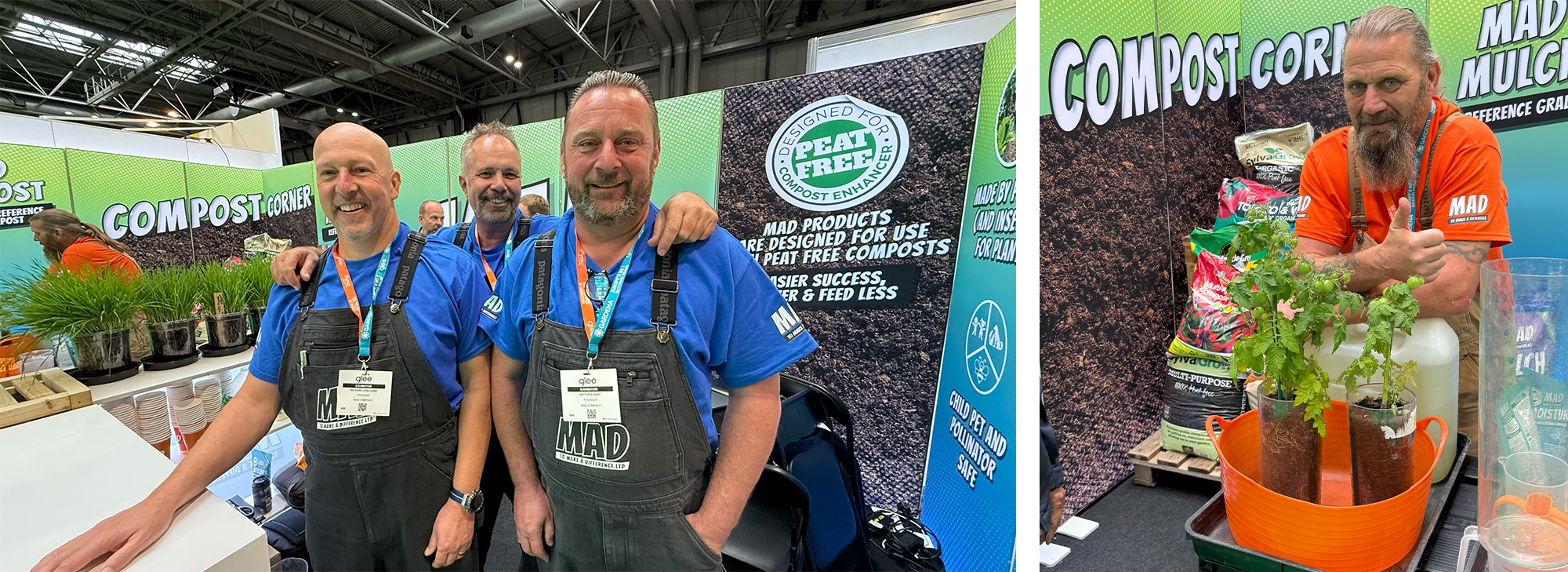
MAD: Compost with character (and the courage to be bold)

MAD were impossible to miss. The stand hit like a comic-book splash page: big primary colours, speech bubbles and oversized panels straight out of Pop Art. It looked playful, but there was purpose behind the punch. The visuals drew you in, then the team used that attention to talk about soil health, sustainability and what their products actually do in the garden.

Why it caught my eye

The “graphic novel” feel worked at distance and up close. On approach you got the energy (clean shapes, strong colour, witty headlines) and as you stepped in.  The people made it sing: dungarees and lab coats, playing “scientists-meet-gardeners” with the right mix of humour and know-how about compost and growing better plants. It felt alive, which kept the stand busy.

The details doing the heavy lifting
  • Art meets agriculture: Giant comic panels gave staff an easy way to open a conversation without slipping into jargon.
  • Performers, not just presenters: The team didn’t demo and disappear — they performed. Quick patter, short explanations, and a friendly nudge to handle product or ask questions.
  • Substance behind the style: Under the bright façade sat the serious bit: eco-friendly thinking and a clear link to better soil outcomes. The look got the smile; the content earned the respect.
What people were saying

Visitors called it “lively, fun, and fearless.” Social posts asked if this was Glee or an art gallery, and more than one person said, “Compost just got cool.” When a practical category generates that tone of chatter, you know the creative is doing its job.

Why it matters (for marketers)

Not every category is ‘sexy’. MAD showed that strong visual ideas can make functional ranges feel exciting without losing credibility. The Pop Art device did the hard part — stopping people — so the team could move quickly to the useful bit: what’s in it, what it does, when to use it. That’s a good model for any product that needs a nudge before it gets attention.

What you can borrow
  • Lead with one bold look. Pick a simple visual language and repeat it with discipline across headers, panels and plinths.
  • Write lines staff can say out loud. Short, energetic phrases become memory hooks and talking points.
  • Keep the learning easy. One board to cover “what’s in it / what it does / when to use” means visitors leave knowing something useful.

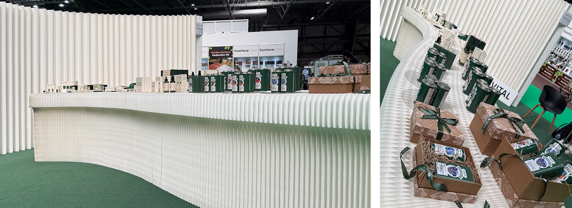
SOWVITAL: Quiet elegance that did more with less

In a hall full of shouty builds, SOWVITAL won by whispering. The stand looked folded into place: crisp planes, sharp angles, and a calm, precise feel inspired by Japanese origami. It was minimal without being empty, and clever without showing off. A small footprint that felt intentional from every angle.

Why it caught my eye

From the aisle you noticed the geometry first: clean lines that read like paper creases frozen mid-fold. Step closer and the practicality revealed itself: a compact, modular structure designed to assemble quickly and travel light. As the team joked, you could almost tuck it under your arm (not quite, but the point landed). The whole thing mirrored the brand’s ethos of care and precision: nothing wasted, everything doing a job.

The details doing the work
  • Origami influence, used with restraint: Every surface and join felt considered, giving the stand movement without clutter. It drew you in quietly, which is rare at a trade show.
  • Modular by design: Elements broke down small, went up fast, and looked like they’d ship well. Smart from a cost and sustainability perspective, and it still looked premium.
  • Brand harmony: The pared-back build matched SOWVITAL’s tone; careful, tidy, respectful of materials and nature. The space felt like the product world, not a set.
What people were saying

Visitors called it “a breath of fresh air” and a proof point that less really can be more. In a sea of towering structures, that quiet confidence stood out – and stuck.

Why it matters (for marketers)

SOWVITAL showed that you don’t have to buy height to buy attention. Clarity, pace and purpose can do the job: give people a reason to pause, then make it easy to understand what you stand for. When budgets and calendars are tight, a compact, re-usable stand that still looks premium is a competitive advantage.

What you can borrow
  • Pick one design idea and be disciplined. Here it was “folds”: the same language across walls, counters and edges, so nothing felt random.
  • Design for re-use first. Plan the breakdown, cases and re-skins before you fall in love with finishes. The stand should look as good at show three as it did at show one.
  • Let calm do the stopping. If your brand is about care and precision, turn down the volume and turn up the detail. People notice.

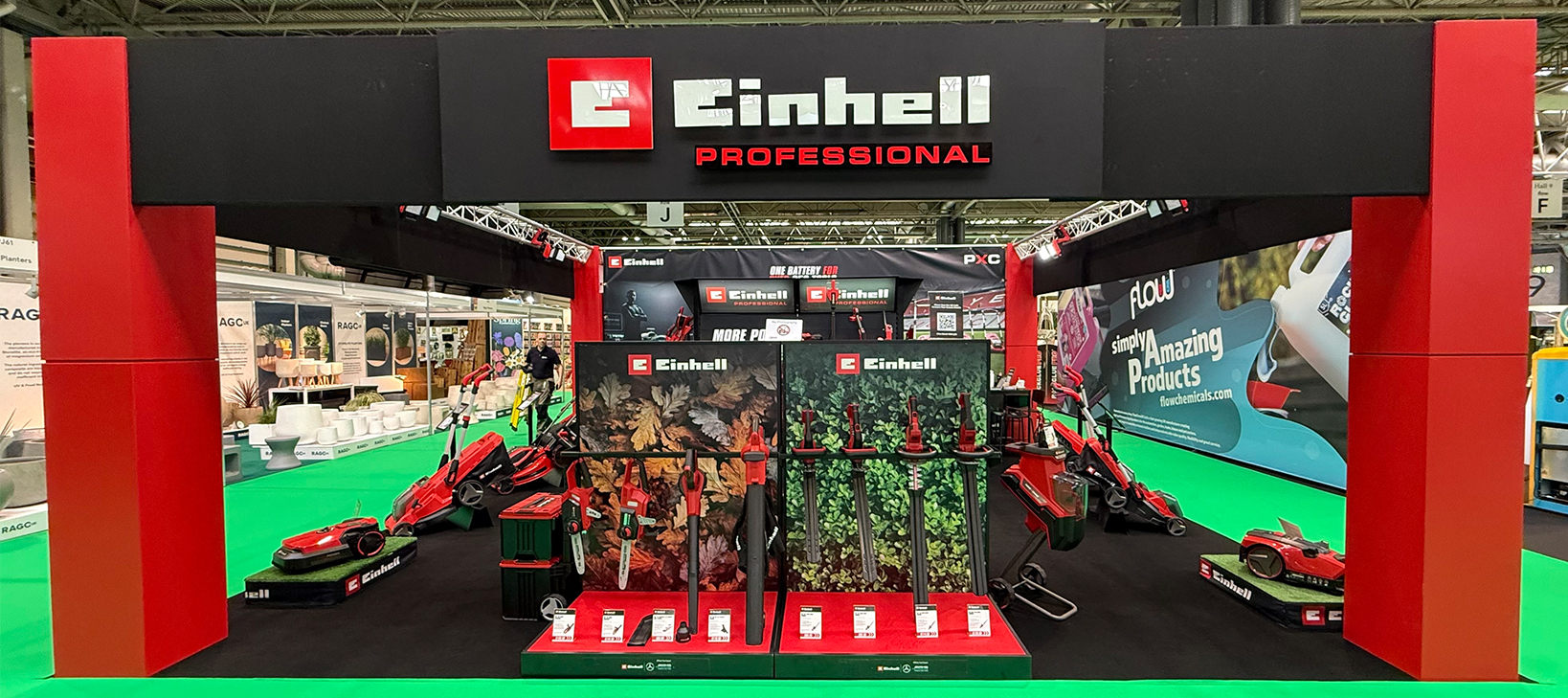
Einhell: Performance, front and centre

Einhell felt less like a stand and more like a set-piece about momentum. The backdrop carried the mood: racetrack lines and stadium light that suggested speed and control. It wasn’t just decoration; it framed how you looked at the kit. Front and centre sat the new mowers and garden tools, presented as you’d stage high-performance gear. The whole space read as confident, modern and purposeful.

Why it caught my eye

Approaching the stand, the visual language was immediate – movement, energy, precision. Step in and the layout did the rest: clear zones for cordless innovation, sustainability features and performance-driven design, so you could navigate easily. Staff kept the pace up with short demos and useful chat, reinforcing the idea of power without compromise.

The details doing the work
  • Dynamic backdrop: Motorsport and stadium cues created a sense of speed and accuracy that fit the brand’s engineering story.
  • Hero staging: Each mower and tool was given space and height, so it read like serious kit, not a commodity.
  • Simple wayfinding: Cordless, sustainability and performance areas were easy to read at a glance, which kept flow smooth.
What people were saying

Visitors called it bold, modern and full of energy. Posts picked up on the sport-inspired visuals as a neat way to link engineering with everyday gardening, which is exactly how it came across in the moment.

Why it matters (for marketers)

This is a good example of a stand doing two jobs at once: the backdrop sets the tone (performance), and the product zones make evaluation easy. When you’re showing a new range, that clarity shortens the jump from interest to shortlist.

What you can borrow
  • Pick a single visual idea that matches your product’s essence (here: speed/precision) and carry it through the whole space.
  • Stage heroes like heroes. Give each key product space and let it stand proud.

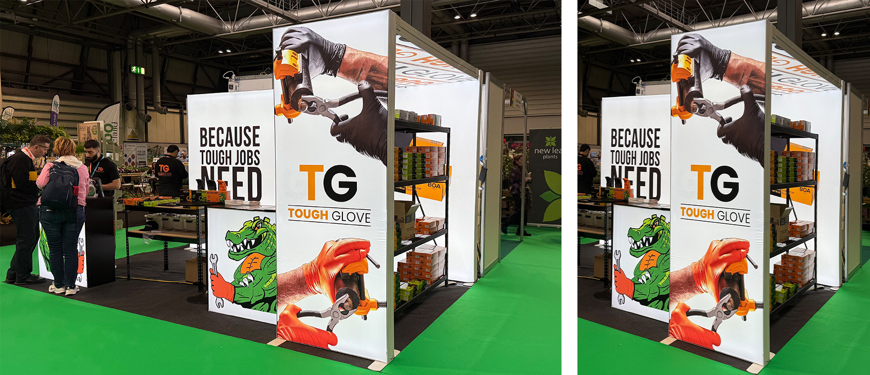
Tough Glove: Small footprint, big glow

Tough Glove didn’t try to be the biggest stand in the hall. They didn’t need to. They turned a compact space into a beacon: walls lit from within, an illuminated canopy overhead, and bold, crisp graphics that read cleanly at a glance. The light did the first job, pulling you in, and the tidy presentation did the rest, making the gloves look sharper, tougher and more premium than a simple rack ever could.

Why it caught my eye

Lots of small stands disappear into the background. This one didn’t, because the team used light boxes everywhere: side walls and ceiling – to create depth and a sense of occasion. The glow lifted the colours, clarified the branding and gave the range a proper stage. It wasn’t just “showing gloves”; it framed them, so durability and design shared the spotlight.

The details doing the work
  • 360° illumination: Back-lit walls plus an overhead panel created a premium, high-tech feel without adding clutter.
  • Smart use of space: Product holders were built into the glowing planes, so every inch worked and nothing looked bolted on.
  • Brand clarity: Strong, simple graphics read instantly against the lit surfaces — no squinting, no guesswork.
What people were saying

The stand earned “a perfect example of doing more with less” in social posts — proof that the lighting choice wasn’t just pretty, it increased visibility and recall. Visitors called it “clean, modern and eye-catching,” which is exactly how it felt.

Why it matters (for marketers)

Lighting is often treated as décor; here it was the selling tool. Good illumination does three useful things at once: it boosts stopping power on approach creating a beacon, and raises perceived value; all crucial when your product is tactile and bought on quality cues. Tough Glove showed that spend on lighting can outperform spend on extra graphics in a small space.

What you can borrow
  • Budget for light first. If your product relies on finish or colour, put money into back-lighting and canopy glow before adding more panels.
  • Integrate, don’t attach. Build product housings into the lit structure so the display feels intentional, not improvised.
  • Keep copy minimal. Let the light and a single bold line carry the message; save detail for the close-in view.

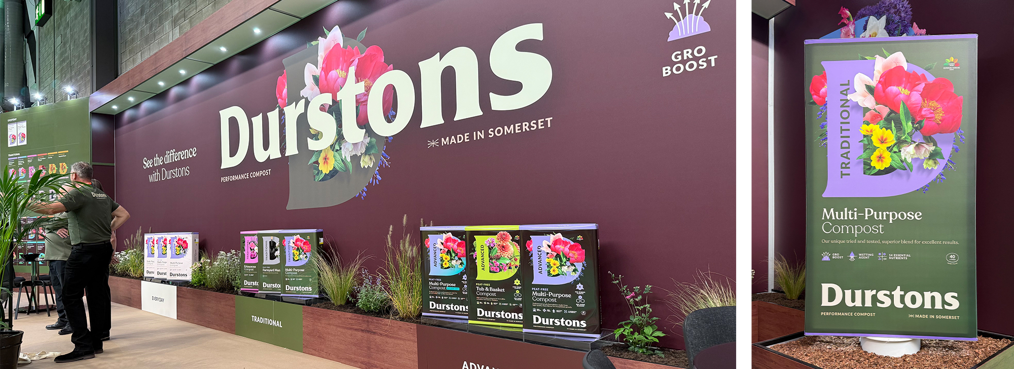
Durstons: A simple idea, executed with confidence

Durstons’ stand unveiled their new brand identity: a bold ‘D’ bursting with flowers. It did the first job brilliantly: stopped you in your tracks. And it also summed up what the brand is about: helping things grow. The rest of the space followed that lead. Clean lines, a classical colour pallete and vibrant imagery made the stand feel airy and upbeat, more like a small installation than a trade booth. It proved you don’t need complexity when the core idea is strong and well presented.

Why it caught my eye

The new Durstons branding was elegant yet powerful; a visual metaphor for what their products do every day: helping things grow.

The details doing the work
  • Iconic branding: The oversized ‘D’ gave every camera angle a focal point and made the identity unmistakable.
  • Colour with purpose: floral colour story lifted energy and made the range feel fresh, while earthier notes kept it grounded.
  • Straightforward messaging: Lines reinforced sustainability, quality and trust: simple words that matched the visual confidence.
What people were saying

Feedback on the day called it “fresh, modern, and full of energy.” Posts highlighted the floral ‘D’ as “a simple idea executed brilliantly.” In a busy hall, that kind of clarity wins attention and memory.

Why it matters (for marketers)

When you’re refreshing a look in a practical category, one strong device can do a lot of heavy lifting: it aids recognition, gives you a repeatable asset for POS and social, and keeps production efficient across formats. Durstons’ approach shows how a single, confident visual idea plus plain-English cues can carry a whole stand.

What you can borrow
  • Pick one hero mark and let it lead the story across walls, plinths and print.
  • Use colour to signal mood, not just decorate. Bright where you want energy, natural where you want reassurance.
  • Keep copy human: Short lines about sustainability, quality and trust will land faster than technical digressions.

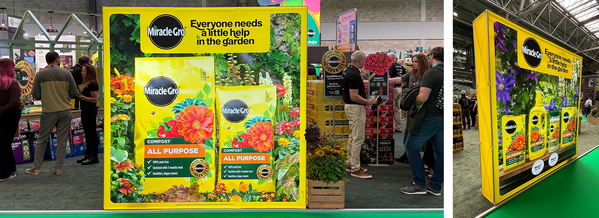
Evergreen Garden Care: Bright, welcoming, and built for proper conversations

Even from a distance you got the mood instantly: confident yellow, clean campaign-style light boxes and product zones that actually explained things. The effect was upbeat rather than shouty. Step inside and the set-up did exactly what you want at a busy show, it slowed people down without creating a queue. The space invited photos, but more importantly, it invited a useful chat about lawns and growing media.

Why it caught my eye

Plenty of stands look good at 10 metres and fall apart close up. Evergreen held together. The big hero visuals did the stopping, then the education panels and tidy product displays did the work. Simple headings, short lines, clear “use this when…” cues were easy to scan, easy to remember. The result was a stand that felt friendly and helpful, not salesy.

The details doing the work
  • Colour with purpose: The bright yellow wasn’t just branding, it was a beacon. You could find the stand from across the hall, and the colour carried through the details so it stayed recognisable in photos.
  • Campaign look, not show graphics: The illuminated panels read like adverts: headline, image and benefit, which made the whole thing feel more premium and more considered.
  • Hospitality that earns its keep: The coffee bar created natural dwell. While drinks were made, staff had a clear 60–90 seconds to engage in conversation and point in the right product.
  • Clear product stories: Ranges were grouped by jobs-to-be-done (lawn repair, feeding, weed control) with plain-English prompts. No hunting for small print.
  • Good flow: Open corners, straight sightlines and enough space around the hero pieces so people could get hands on without blocking anyone else.
What people were saying

Comments through the day were variations on the same theme: “bright, cheery, and genuinely helpful.” Visitors lingered, took shots of the light boxes, and left with a clear picture of Evergreen’s brands; exactly the sort of recall you want the following day.

Why it matters (for marketers)

This is what a hard-working stand looks like: one bold look to draw people in, and practical guidance to keep them there long enough to move from curiosity to intent. Hospitality wasn’t a gimmick; it bought attention that the team used well. And because the visuals photographed cleanly, the stand kept working in post-show follow-ups and social recaps.

What you can borrow
  • Lead with one confident colour and a single headline per panel. If someone only reads six words, make them count.
  • Design a short “coffee-length” script. One tip, one match-to-need, one next step: repeatable by the whole team.
  • Group by job, not by SKU. Help visitors self-select in seconds, then layer the detail for those who want it.

Hortus: Art school meets garden retail (and it works)

While many exhibitors leaned into lifestyle styling or bold branding, Hortus took inspiration from the world of modern art. The stand structure riffed on Mondrian: clean grids, solid blocks, and strong divisions, but built it from garden sleepers so it still felt rooted in the garden. That simple switch turned the space into something between a gallery and a garden aisle. The result: people slowed down, looked properly, and treated the stoneware like pieces to choose, not piles to sift.

Why it caught my eye

From the aisle, the geometry was an instant attraction: square-on lines, neat rectangles, clear negative space. Step in and the logic reveals itself: the sleepers act as frames, giving each pot or piece its own “slot” so form and finish are easy to judge. It read as considered rather than styled for styling’s sake, which is why it stuck.

The details doing the work
  • Modernist grid, practical bones: The Mondrian cue delivers instant order; the sleepers anchor it in real materials, so it never goes cold or abstract.
  • Stoneware as sculpture: Pieces were set like exhibits, not stacked, a small change that lifts perceived value and makes colour and glaze read true.
  • Clear sightlines: The grid creates front-on photographs from almost any angle, which helps with post-show decks and social recaps.
What people were saying

Visitors called it “a breath of fresh air” and “a perfect fusion of art and retail.” Posts even joked “Mondrian would be proud.” The tone of that chatter tells you the approach landed: familiar reference, executed simply, remembered easily.

Why it matters (for marketers)

When a range risks looking commoditised, framing beats piling. Hortus showed how a recognisable visual idea can help buyers make sense of options fast, while nudging up desirability. The lesson: curate the view, don’t just increase the view.

What you can borrow
  • Choose one organising device (a grid, a colour block, a shape) and run it through everything: shelves, headers and plinths – so the stand reads in one glance.
  • Frame fewer, show better. Give hero SKUs space and labels; keep the depth stock off the eye line.
  • Use “real” materials to keep design warmth when you lean on graphic order.

Keira: Turning a setback into a story

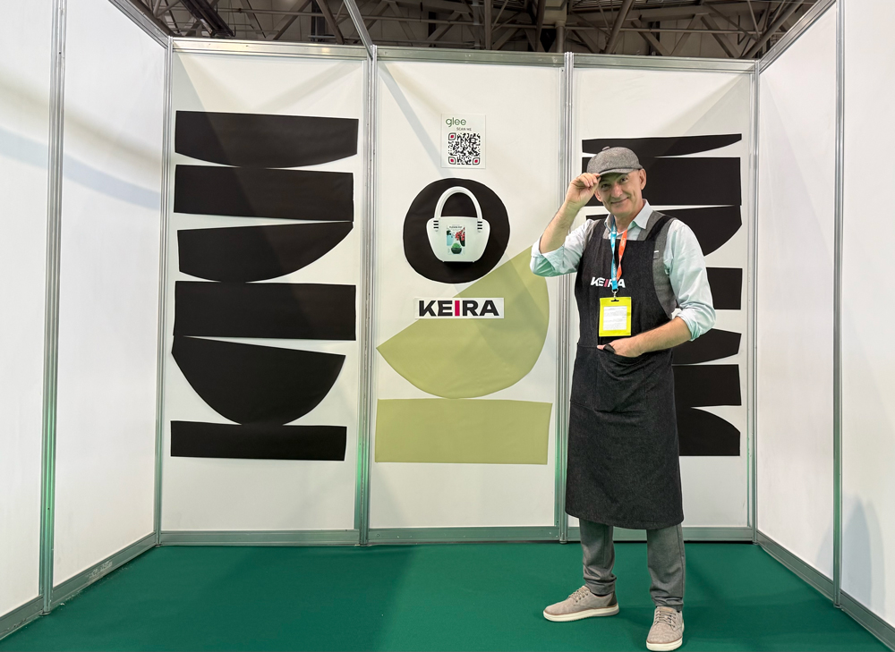
Not every memorable stand is meticulously planned. Keira’s most powerful asset turned out to be honesty. On day one the brand’s product shipment was stuck somewhere between Croatia and the UK, leaving an almost empty space. With just one sample, a QR code and some borrowed black sticky vinyl, Igor turned absence into intrigue. It looked stark, but that was the hook: people stopped, asked, and scanned. By day two, still with no product, he’d had a steady flow of visitors engage digitally. And in true dramatic fashion, the stock arrived three hours before the show closed on day three.

Why it caught my eye

Trade shows reward confidence and clarity. Keira showed both, just not in the usual way. The emptiness read as deliberate minimalism; the QR did the heavy lifting; and Igor’s energy and openness made the encounter feel human rather than apologetic. It sparked the right questions and, crucially, it kept the conversation going even without a full display.

The details doing the work
  • Minimalism as magnetism: A near-blank canvas created curiosity: visitors stepped in to find out “what’s the story?” rather than walking past.
  • Digital pivot: The QR code became the stand, linking straight to the full range and info while logistics caught up.
  • Human touch: Igor’s presence was the differentiator: personable, transparent, and proactive, which turned a problem into goodwill.
What people were saying

Reactions ranged from “Is this a stunt or a statement?” to praise for the resilience and creativity on show. The chatter proved the point: sometimes the most memorable marketing is improvised.

Why it matters (for marketers)

Things go wrong. Keira is a reminder to plan a digital back-up and a simple conversation arc for when they do: acknowledge the issue, invite the scan, book the follow-up. You won’t always have the perfect set, but you can always keep momentum.

What you can borrow
  • Have a “plan B” ready: A QR to a concise landing page or short video demo so interest isn’t wasted if samples are delayed.
  • Own the narrative: Turn logistics into a human story. People remember candour and effort.
  • Keep one physical touchpoint: Even a single hero sample gives the eye (and camera) something to land on.

What the best stands had in common

One clear idea. Everyone could tell what each stand was about from a few steps away.

Messages you can read in motion. Big, simple lines at distance; detail when you step in.

A reason to linger. A demo, a tip, a coffee, always in service of the making the message stick.

Something to take away. A scan, a story, a photo that still looks good tomorrow morning.

Built for reuse. Modular parts and a hero device you can redeploy all year.

If you want your next stand to look great and work harder, we can help plan the story, design the space and script the moments that keep people talking long after the carpet’s lifted. Let’s plan your 2026 show now.

Need help bringing your brand vision to life? Get in touch!

WrightObara
Lower Park Barn
Chilton Business Centre
Chilton
HP18 9LS

Tel: +44 (0)20 80 92 92 79

The latest episode of The Underground Podcast, recorded live at Glee 2025, brought together two established names in the garden sector who are proving that evolution not reinvention is the real driver of long-term success.

Between Durstons’ confident new rebrand and Woodlodges thoughtful approach to product and merchandising strategy, the conversation revealed what happens when heritage businesses commit to innovation, clarity, and purpose.

Brand evolution built on performance and trust

For Durstons, the family-run growing media manufacturer, 2025 has marked a turning point. After decades of quiet consistency, the company unveiled a bold new brand identity that has transformed how it’s seen on the show floor and beyond.

We’ve had lots of lovely comments about how strong the branding looks — its classical colours and its heritage feel,” said Managing Director Dan Durston. “We feel that the change we’ve made has really elevated our business and our brand.

The rebrand, developed with Future Kings, began as an advertising brief but grew into something more profound. It gave Durstons a visual and strategic language to match the quality and reliability their customers already associated with the product.

For co-host Phil Wright, it’s a creative transformation that works: “It feels premium and unified, a family of products that flow together.

But the design work is only part of the story. The rebrand is also a signal of deeper operational confidence. In recent years, Durstons has tripled its production capacity and invested heavily in its peat-free product development; not just to meet legislation, but to stay ahead of it.

As Simon Blackhurst put it, “Performance is the key element — when a consumer opens that bag, it has to work.” Consistency, both in formulation and delivery, is what builds lasting trust.

Educating for the peat-free future

The shift towards peat-free products remains one of the most significant challenges in growing media. For Durstons, it’s as much about education as it is about innovation.

We need to keep banging that drum,” said Simon. “Peat-free isn’t difficult, it’s just different. The whole industry needs to help consumers understand that.

It’s a message echoed across the sector: sustainability must be paired with communication. Clearer signage, better in-store advice, and aligned messaging across brands can reduce confusion and build consumer confidence. As the Enrich the Earth campaign and other collaborations have shown, consistency in communication is just as important as consistency in product quality.

Design, data and direction at Woodlodge

When Kate Ebbens joined Woodlodge earlier this year as Commercial Business Manager, she stepped into one of the UK’s largest and most design-led suppliers of outdoor and indoor garden products.

Her perspective is refreshingly holistic: it’s not just about what’s in the range, but how the range is presented. “It takes a huge amount of work to make a stand look effortless — but that’s what great merchandising does.

At Glee, Woodlodge showcased not only its renowned planter collections but also an expanding portfolio of recycled plastic pots, part of a wider move towards sustainable materials and value-driven design. “Garden retail has evolved,” said Ebbens. “Customers are more design-conscious, sustainability-minded and value-driven than ever before.

Her insight points to a growing truth in garden retail: visual presentation and product storytelling have become core differentiators. As buying groups, independents and consumers seek stronger connections between indoor and outdoor living, the brands that lead with design and education will shape the next phase of the category.

“Customers are more design-conscious, sustainability-minded and value-driven than ever before.”

Kate Ebbens

Purpose as the ultimate motivator

Beyond the business, Ebbens also shared her latest challenge: leading a group of industry peers on an expedition to climb Mount Kilimanjaro in 2026, and in the process raising £100,000 for Greenfingers Charity. It follows her remarkable achievement of running 5K every day throughout 2024 to raise funds for children’s hospice gardens.

For a sector built on growth, hers is a reminder of what truly sustains it: purpose. “Every step up that mountain will help fund a Greenfingers garden,” she said. It’s the kind of motivation that resonates deeply across an industry that thrives on community.

The takeaway: clarity, consistency and care

Across both conversations, three themes stood out that garden brands would do well to note:

  1. Clarity of brand: a clear, confident visual identity makes it easier for retailers and consumers to engage.
  2. Consistency of product and message: from peat-free blends to point-of-sale materials, reliability builds reputation.
  3. Care for purpose: whether through sustainability or charitable work, authentic intent strengthens trust and loyalty.

As the garden industry continues to navigate change, from legislation to lifestyle trends, brands like Durstons and Woodlodge show that growth doesn’t mean losing your roots. It means tending them, thoughtfully and with intent.

The Underground Podcast is produced by WrightObara, creative partners for home and garden brands. Listen to the full episode: